top of page
UNITED STATES
NATIONAL ARBORETUM
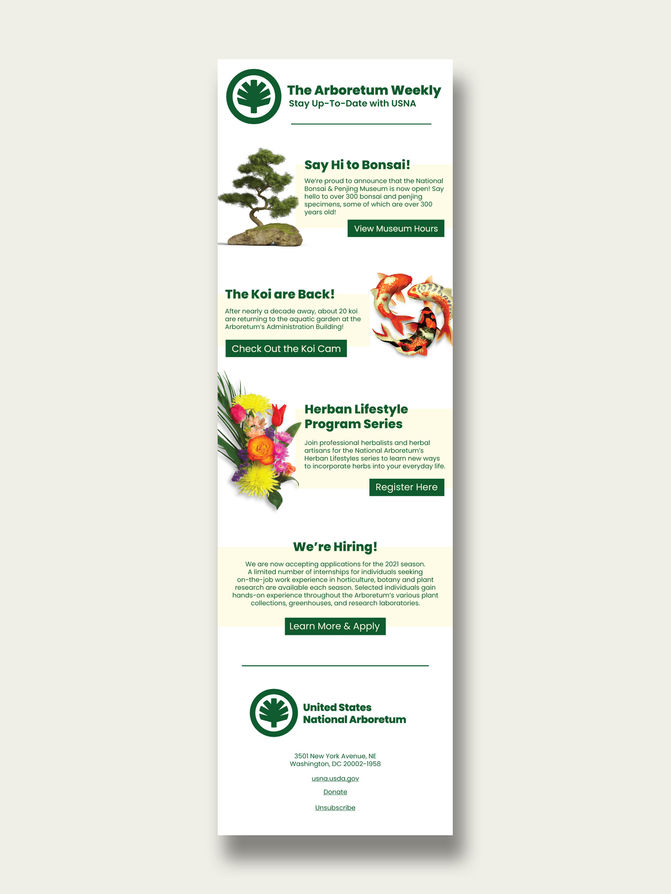
The National Arboretum is one of my favorite places to visit in DC. Naturally, I decided to give their identity a refresh.
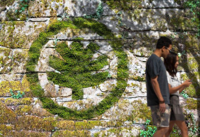
I started with the logo; trimming the hedges and encapsulating it in a circle to introduce a simple, easy to recognize, and versatile form. In choosing an official font, I went with something close to the Helvetica used by WMATA. This font is a bit heavier and more round, which is slightly less formal and better complements the logo.
Overall, the new logo and typeface speak the USNA's mission, symbolize the importance of plants and trees, and evoke a more inviting feel, encouraging more visitation and learning.

bottom of page


