top of page
POP DISPLAYS
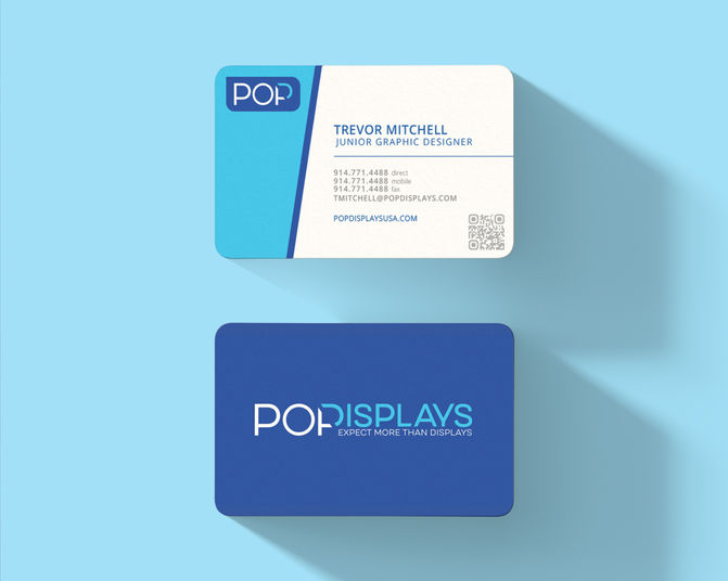
POP Displays USA (usually called 'POP' by employees) is a top point-of-purchase display and merchandising company that was in need of a rebrand following their move from Yonkers to Rye Brook, New York. Their previous logo featured bold, Impact type, and a white-grey-navy blue color combination. I decided to incorporate a light blue and a thinner typeface for a lighter, more modern look, and to add to the logo's character and versatility.
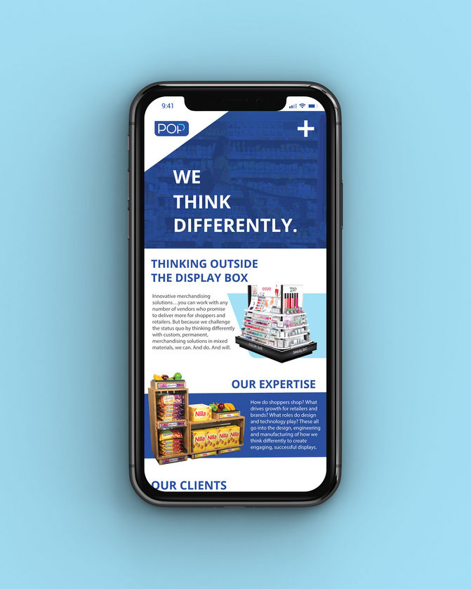
I also worked on presentations and instruction manuals for many of POP's clients.

bottom of page


